
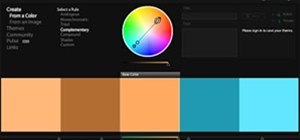
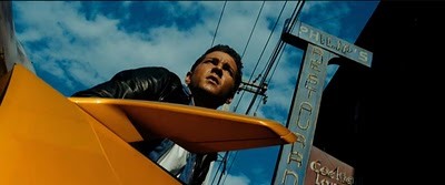
I'm really glad someone finally wrote this article. Todd Miro @ Into The Abyss details the teal and orange look that's pervading mainstream and independent films. In essence, because orange is the color that is the closest to skin tone, DI colorists are forcing its complementary color - teal - into the image. It's a simple trick that, when used subtly, can create color contrast and really pop an image. Unfortunately, more often than not, actors look like Snooki's cousin and trees and shadows are as reductive as 2 strip technicolor blues.
Here are some recent examples, not listed by Miro, that come to mind:
-Brothers
-Greenberg
Feel free to add to the list.
Just updated your iPhone? You'll find new emoji, enhanced security, podcast transcripts, Apple Cash virtual numbers, and other useful features. There are even new additions hidden within Safari. Find out what's new and changed on your iPhone with the iOS 17.4 update.


Be the First to Comment
Share Your Thoughts